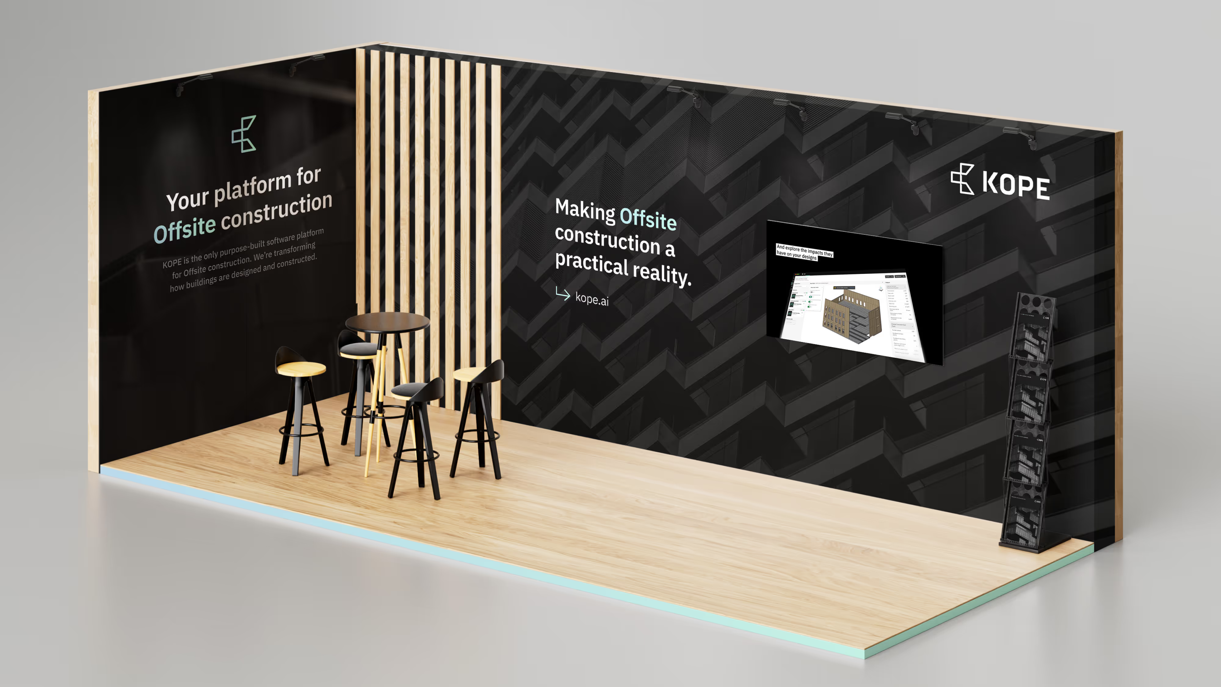
Your platform for offsite construction
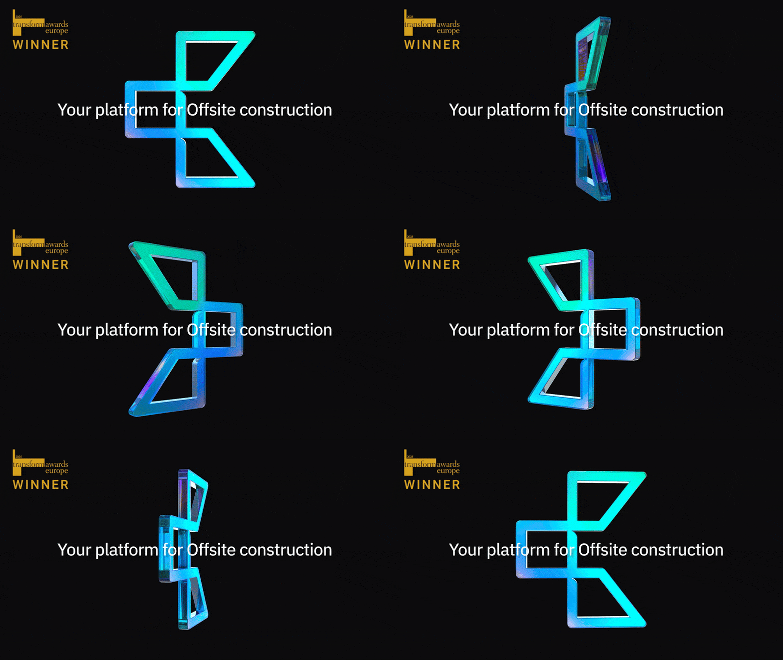
A comprehensive brand refresh
KOPE is an architectural technology platform. It takes the manual task of breaking down design models into physical parts and automates it instantly. It’s a hugely innovative approach that could shake the foundations of the construction industry. However, the team at KOPE were struggling with people taking too long to understand the platform’s benefits.






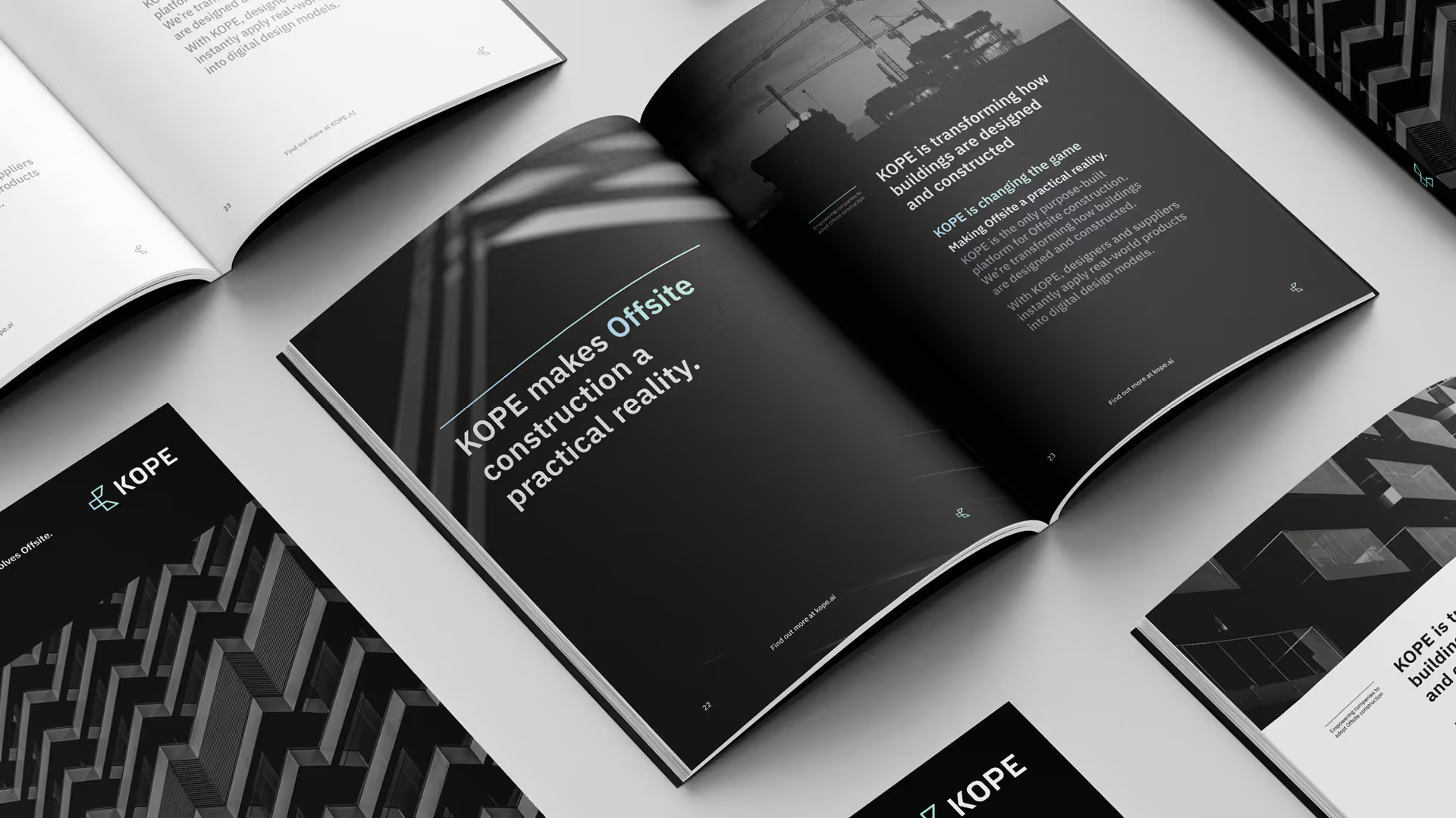

Championing the materials used in construction
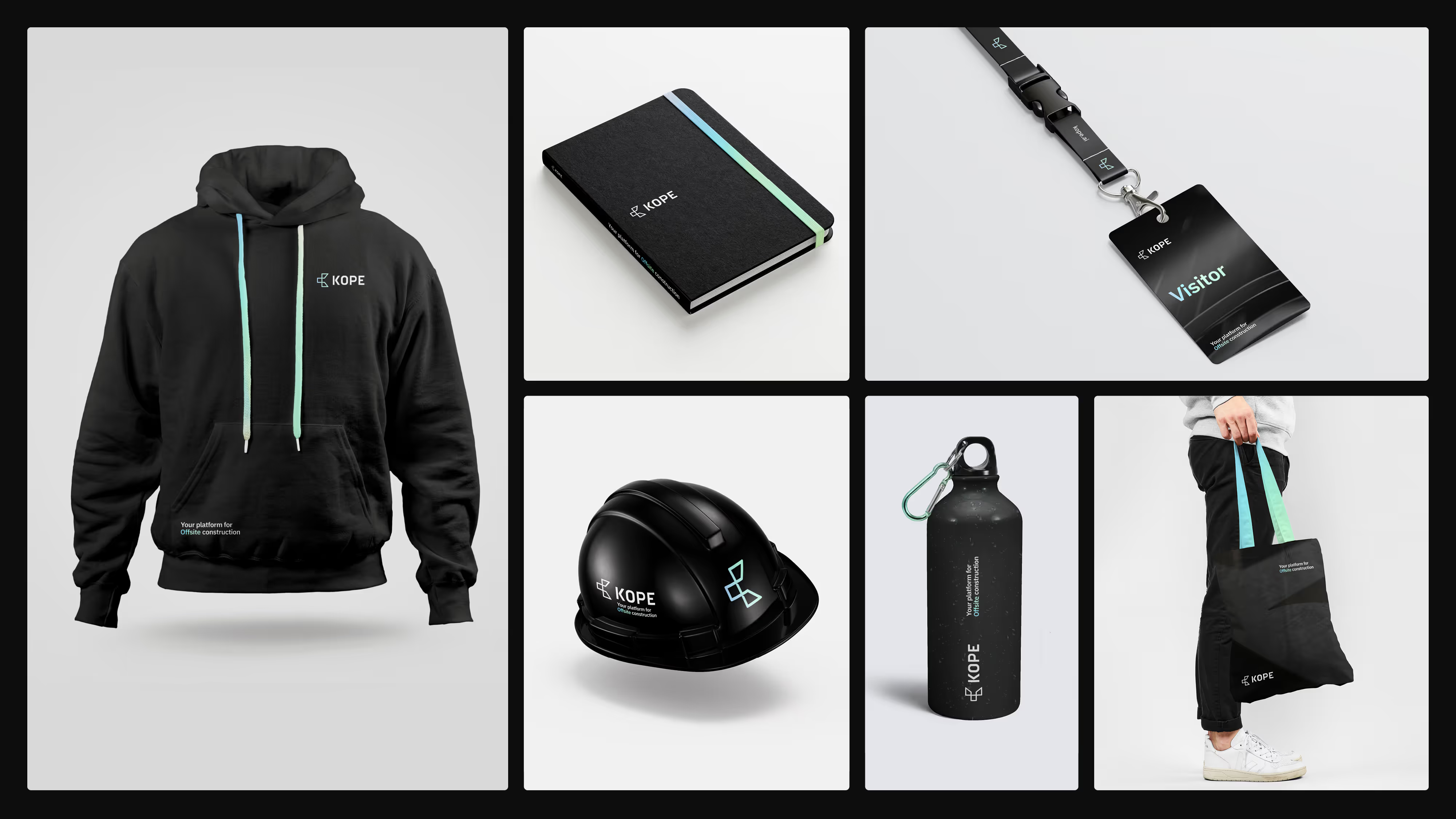
We refreshed KOPE’s design direction, championing the physical materials used in construction. We kept stronger elements of the existing visual identity, such as the logo, but added structure and more effective use of colour.
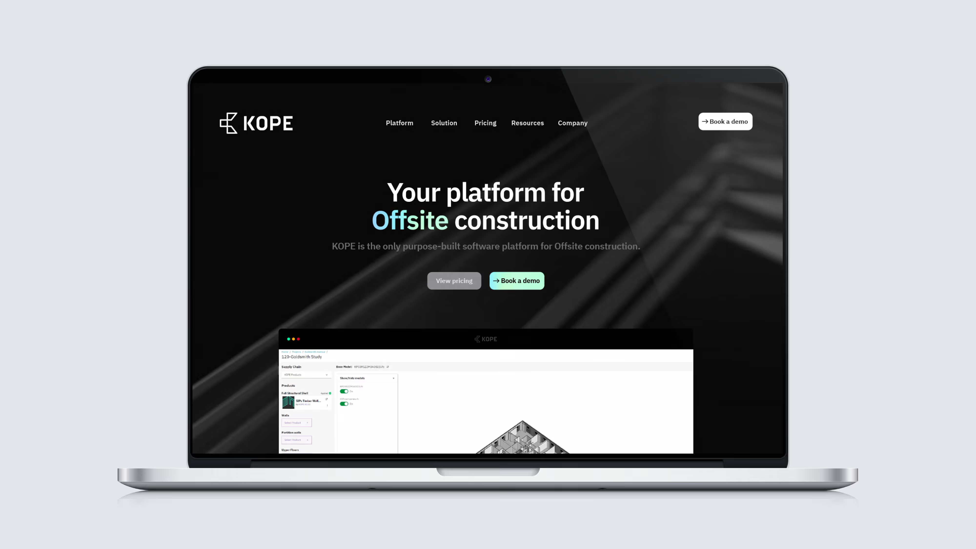
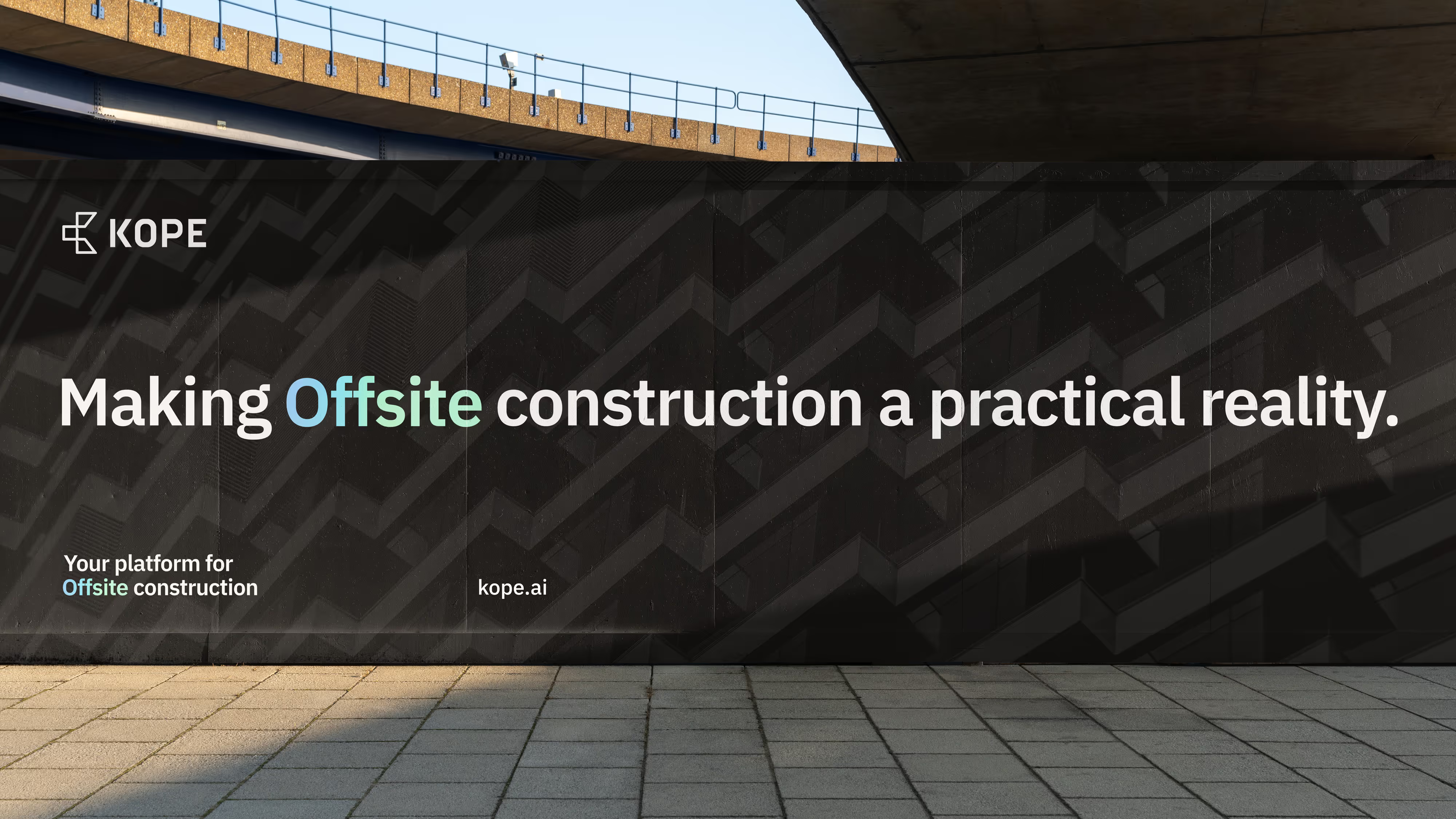
Making offsite construction a practical reality
We created a brand strategy that helped focus KOPE’s identity and bring its marketing efforts under a core goal. We shifted KOPE to a platform-first approach, presenting a brand image that was both easier to recognise and easier for people to understand the core value proposition without getting lost in the details of different products.
